 Wishlist
Lab › Blog · 2026-11-10
Steam page teardown #2: The Apartment and plexum
Every week we pick a couple of Steam pages whose developers asked for feedback, run them through the free WishlistLab audit and then go through them by hand. You get what already works, the three fixes we think would make the biggest difference, and before/after copy you can borrow. (Last week's teardown covered Farmdustry and Tourbillon.)
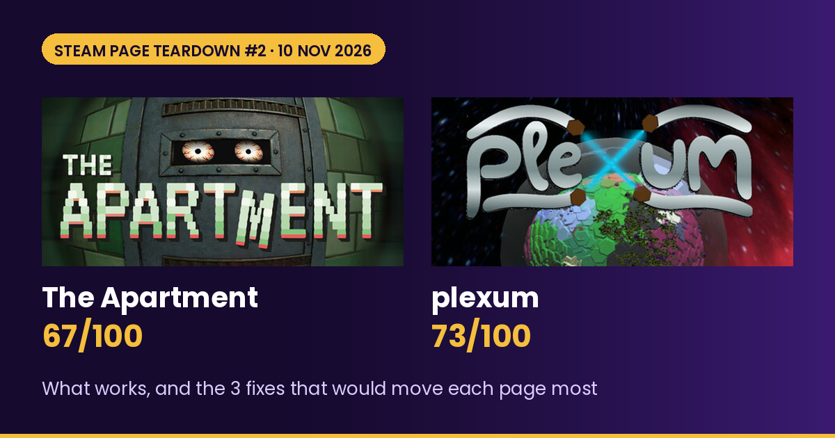
This week's developers both put their hands up. The team behind The Apartment asked publicly on X for "honest feedback on our Steam page, especially what you'd change" (their post), and the plexum developer ticked "OK to feature my game" when they ran their audit. The two games couldn't be more different, a single-room horror game and a planet-hopping factory builder, but they turn out to have the same main problem.
| Game | Developer | Score | Weakest area | Full report |
|---|---|---|---|---|
| The Apartment | Ultima Thule Labs | 67/100 | Social proof (5/10), trailer (9/15) | Report |
| plexum | Studio Jephinca | 73/100 | Social proof (0/10), trailer and screenshots (11/15 each) | Report |
Both pages are above the middle of the pack, and both have About sections that scored 9 or 10 out of 10. The points left on the table are in the first things a shopper sees: the capsule, the first screenshots and the opening of the short description.
The Apartment: 67/100
The Apartment on Steam · first-person psychological horror, coming 2026 · by Ultima Thule Labs
What already works
- The premise is a great hook. A polite neighbor who knows every package you get, and wants his share. It's specific, it's a little funny and it's creepy, which is exactly the mix that gets horror fans to click.
- The About section builds dread. "He seems polite. Attentive. A little too attentive." Short lines, a slow turn, and then a siren and a countdown. It scored 9/10, and it finishes with the right promise: "Multiple endings. Not all of them let you survive."
- The capsule has a face. Two bloodshot eyes behind a door slot, a chunky pixel logo and a wonky "M". It's memorable, and the audit gave it 12/20, which is good for a Coming Soon page.
- Plenty of screenshots and spot-on tags. 14 screenshots (the median across pages we've audited is 9), and the tag list starts with Psychological Horror, Horror, First-Person, Atmospheric, Puzzle and Mystery, which is exactly where this game should be sorted.
Fix 1: Show the neighbor in your first screenshot (+2 pts possible, plus a better trailer)
Most shoppers look at the first three or four screenshots and leave. Right now The Apartment opens with a fridge in the dark, then moving boxes, then a TV and a fishbowl. They're atmospheric, but the star of the game, the neighbor behind the door, doesn't turn up until shot 5. The marketplace screen where you order the packages he wants is shot 6.
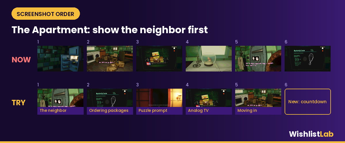
Try: (1) the neighbor's eyes in the door slot with "You're more foolish than I thought", (2) the marketplace order screen, (3) the "How many chickens are painted in this apartment?" puzzle prompt, (4) the analog TV, (5) moving in, and (6) a new shot of the siren and countdown, which the About section promises but no screenshot shows. The door appears in three of the 14 shots, so you can drop one or two of those and some of the darker shots without losing anything.
The audit's trailer note is the same idea in motion: open the trailer on the apartment, a package and the countdown within the first 5 to 10 seconds, before any slow build-up. Our trailer tips guide and the screenshot and trailer checker go into this.
Fix 2: Put "psychological horror" first, and keep the punchline (+2 pts possible)
The short description is the right length (183 characters, under our median of 231) and well written. The only problem is the order: the genre arrives in the very last sentence, so a shopper skimming a list sees "A new apartment" and has to read to the end to learn it's horror.
Before (183 chars): "A new apartment. A polite neighbor who knows every package you get. He wants his share. Every day, a little more. Keep him fed or become the meal. A first-person psychological horror."
After (182 chars): "First-person psychological horror in one apartment. Your polite neighbor knows every package you get, and he wants his share. Keep him fed, decode the countdowns, or become the meal."
Same voice, same ending, with the genre and the countdown mechanic moved up. More examples are in our short description guide and the short description checker.
Fix 3: Make the eyes bigger so they survive at search size (+5 pts possible)
At the 460px header size, the capsule works. At 184px (search results) and 120px (small rows), the logo still reads, but the eyes, the thing that makes it scary, shrink to two pale dots.
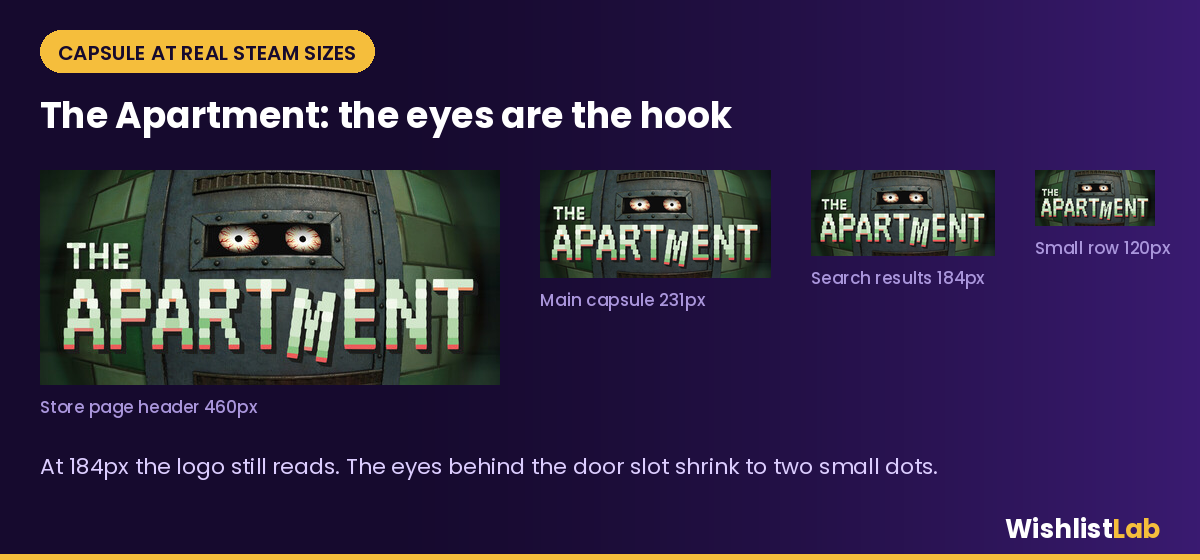
Before: steel door filling the frame, a narrow slot with small eyes near the top, the logo across the lower half. After (brief for your artist): crop in so the slot is about twice as tall and the eyes take up a third of the width. Brighten the whites of the eyes and add a faint red glow so they pop against the dark green tiles. Give the logo a darker outline for more contrast, and keep the wonky "M", because it's charming. Check the result in our capsule size checker, and see the capsule art guide for what tends to read at small sizes.
Bonus: the release date just says "2026", and the audit gave social proof 5/10. A playable demo, even a short slice of the first day in the apartment, is the quickest way to get early quotes, and it lets you join events like the February Next Fest. Our Next Fest demo tips cover what to include.
plexum: 73/100
plexum on Steam · 3D planetary automation sim, in Early Access with a free demo · by Studio Jephinca
What already works
- The About section is the best we've seen in a while. It's written as a caretaker's diary ("Day 3 - I've come across some blueprints to make all sorts of vehicle related items"), so each day quietly teaches a mechanic: ores, machines, roads and depots, then sealed factories as the gravity changes. It scored a full 10/10.
- There's a real twist on the genre. You can only build small factories because of the curve of the planet, and terraforming forces your machines indoors. That's a genuinely new reason to rethink a factory, and it's worth shouting about.
- The proof points are there. Two trailers, a free demo and a fair Early Access price (£10.59 at the time of writing).
- The tags are accurate. Automation, Resource Management, Building and Base Building lead the list, so Steam is already showing plexum to factory fans (13/15 for tags).
Fix 1: Say what it is in the first five words (+1 pt possible, but it's the easiest win)
At 296 characters the short description is long (our median is 227), and it opens with "Gather and process resources", which could describe almost any survival or crafting game. The best words on the page, "automation", "sealed factories" and "terraforming", are buried in the About section or the middle of the description.
Before (296 chars): "Gather and process resources into complex tools, machines and materials. Explore ever-changing planets, build factories with purpose and connect production chains through transport and logistics. Make smart use of resources and time as you travel with a mysterious ship on a terraforming mission."
After (182 chars): "3D planetary automation sim: mine ores, build sealed factories, link them with roads and depots, then jump to the next world as your mysterious seed ship terraforms it. Demo out now."
This puts the genre first, names the twist and ends with the demo, which matters because there are no reviews on the page yet. For more, see the short description examples.
Fix 2: Open the screenshots inside a working factory (+2 pts possible)
plexum's first screenshot is the planet seen from space, and the second is a flat foundation at night. They're the start of the journey, but they don't show the automation. The busiest, brightest shot on the page, a sealed factory full of machines, is number 7.
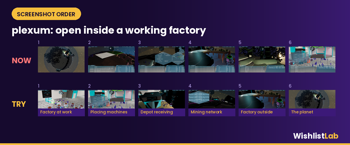
Try: (1) the factory full of machines, (2) the manufactory tool menu inside the factory, (3) the depot receiving tin plate, (4) the mining network panel, (5) a factory out on the surface, and (6) the planet from orbit. One more idea: the ledger and log panels cover roughly the bottom third of every shot. A couple of screenshots with the interface hidden would show off the planets, and the same applies to the opening seconds of the trailer, which the audit flagged as well.
Fix 3: Put a factory in the capsule (+3 pts possible)
The plexum logo is clean and holds up at every size, and the drone beams forming the "x" are a nice touch. But the rest of the capsule is a hex-tiled planet against red space, so at search size it reads as "space game", not "factory game".
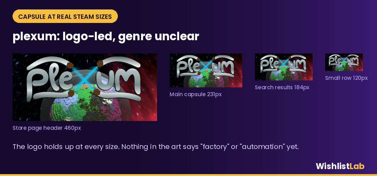
Before: big chrome logo across the top, planet in the lower half, space background. After (brief for your artist): keep the logo and the drone beams. Bring the planet's curve up so its surface fills the bottom third, and put two or three of your teal sealed factories on it, glowing, with a road between them. Even at 120px, glowing boxes joined by a line says "build and connect". Our capsule art guide has more examples, and the capsule size checker will show you how it looks at each size.
Bonus: the audit's biggest single gain for plexum is social proof (0/10, worth about 7 points), because the game is in Early Access with no reviews yet. Mention the demo near the top of the About section, and when the first players leave reviews, quote a line from one in the description.
What both pages could take from this
- Lead with your strongest idea. The Apartment's is the neighbor and plexum's is the sealed factory. Both are on the page, just not in the first few seconds.
- Put the genre in the first five words. You can keep the personality, just put it second.
- Test your capsule at 184px. If the thing that makes your game different disappears at that size, make it bigger.
Want your page in a teardown?
Run the free Steam page audit and tick "OK to feature my game on socials" on your results page. That's how we pick future teardowns. We only feature pages whose developers have opted in or asked for feedback publicly. If you're entering the Auto-Battler RPG Fest (16 to 23 November), our themed fest checklist is a good place to start.
If you want every fix spelled out for your own game, the Deep Audit gives you all of them in priority order with rewrites and a 30-day plan (see a sample). WishlistLab Pro re-scores your page every week so you can see your fixes land. If you'd rather hand the capsule or trailer to someone, you can hire a vetted pro, and Page of the Week puts your game on the WishlistLab home page.
Scores come from WishlistLab's automated audit, run on 10 Nov 2026. The commentary, briefs and rewrites are ours, and they're suggestions, not rules. Screenshots and capsule art belong to their developers and are shown here for commentary.